Chapter 15 Bar Charts, Scatter Plots, Box Plots
Graphs (also called plots and charts) summarize numerical or statistical results. When creating figures for lab reports, research papers, or scientific articles, it is essential that you present numerical data properly. Not presenting your data clearly can confuse or mislead your readers. So making sure your graphs are clear and accurate is essential.
15.1 Common Types of Graphs
15.1.1 Bar Graphs
Bar graphs are good for highlighting trends between treatment groups. The annotated figure below shows the parts of a typical bar graph.
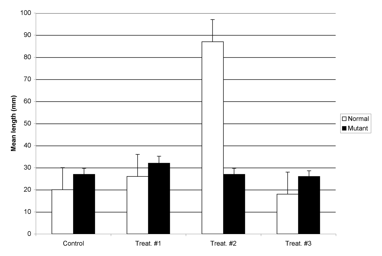
Figure 1. Effect of wastewater on size of zebrafish. Normal fish (white bars) have no observed abnormalities. Mutant fish (black bars) carry a 2 base pair mutation in the multi-drug resistance locus. Fifty adult fish were placed in each group, and exposed for 5 weeks to wastewater collected from three sites (#1, #2, and #3), or dechlorinated water from the city water supply. Lengths were measured from upper lip to the tip of the caudal fin. Each bar is the mean length of a sample of fish from each treatment or control group (n=10/group; error bars are ± 1 s.d.)
The bar graph in Figure 1 is an example of a clustered bar graph, meaning the different treatment groups are displayed side by side. A clustered bar graph is a good choice when you need readers to be able to compare the response of the different treatment groups (listed in the key) under each experimental condition you tested.
A stacked bar graph is shown below. Rather than putting the groups side by side, the bars are stacked vertically. Stacked bar graphs show readers how much the different measurement groups (listed in the key) contribute to the dependent variable you measured. Very often stacked bar graphs have time as the independent variable (X axis).
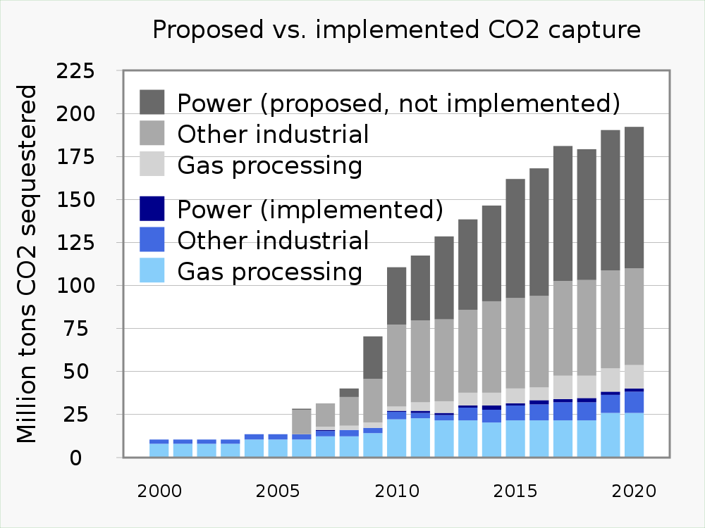
Figure 2. A stacked bar graph. This graph shows relative capacity of different capture technologies to remove carbon dioxide from the atmosphere increased from year to year. Currently used technologies are colored blue; proposed technologies are colored gray.
Often you will see a bar graph without standard error bars. Here is an example:
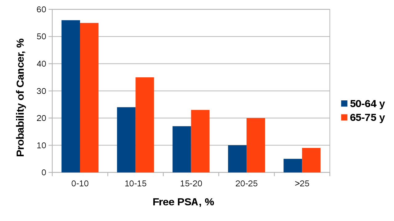
Figure 3. Probability of a cancer diagnosis based on % free PSA in blood for men at different ages.
This bar graph is informative in it tells us that the higher the level of free PSA in blood, the lower the probability a man will have cancer. However, we cannot say for certain if the probability is different between the two age groups. For 0-10% free PSA, it looks like there is no difference in cancer probability between the two age groups. At 10-15% or 20-25% free PSA, it seems like older men are more likely to have cancer, but at 15-20% or >25% PSA, there is not as much of a difference. Without error bars to show the variability in the data, readers cannot estimate whether or not the two age groups have different cancer probabilities for the same free PSA level.
Unless you are told otherwise or have a specific reason not to, you should always include standard error bars for each treatment group. If your reader does not want to see that information, they can ignore it, but if you do not include the standard errors, you have made that choice for them.
15.1.2 Line Graphs
This type of graph displays pairs of numerical variables as points on an X-Y grid. Each pair of variables is connected to the previous pair by a line. The line illustrates the change from point to point.
In line graphs, the X axis does not have to be divided into equal numerical values. All the X axis needs to do is show an ordered relationship. For example, say we want to graph changes in average temperature in June as we move north from the equator. We could make a line graph showing temperature vs. the actual latitude (5o, 15o, 25o, 35o North, etc.), or we could make a line graph for cities at different distances from the equator (Sao Tome, Niamey, Algiers, Madrid, London, Copenhagen, Oslo.) Either line graph would show there is a direct relationship between distance from the equator and average temperature in June.
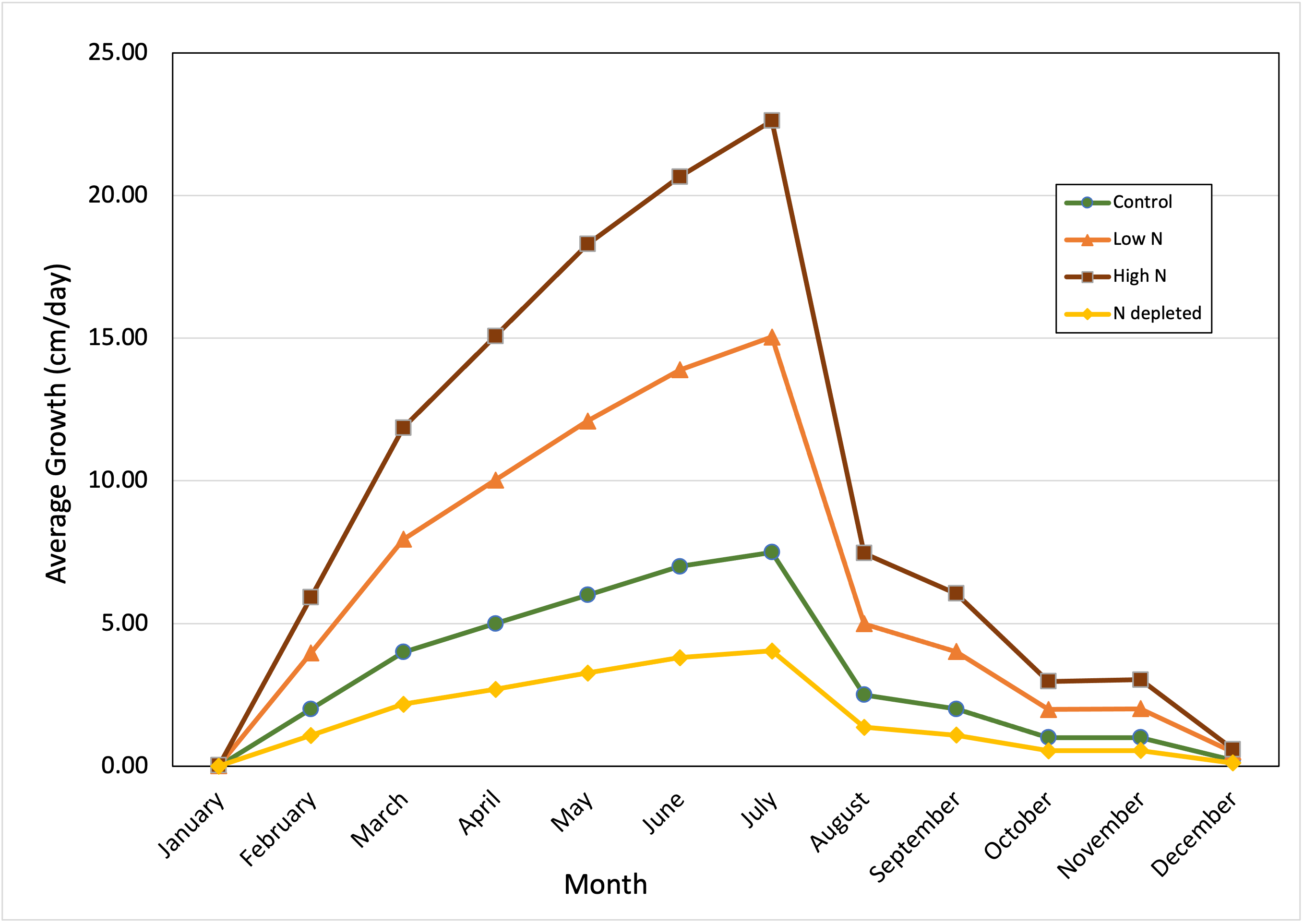
The two panels of Figure 4 show different versions of the same line graph. The first version does not have error bars, while the second version includes them. We include error bars when we want readers to be able to see the amount of variation in the data. Error bars are sometimes left off if the trend in the data line is more important. Generally though, you should include error bars on line graphs for the same reason we include them on bar graphs.
A
B
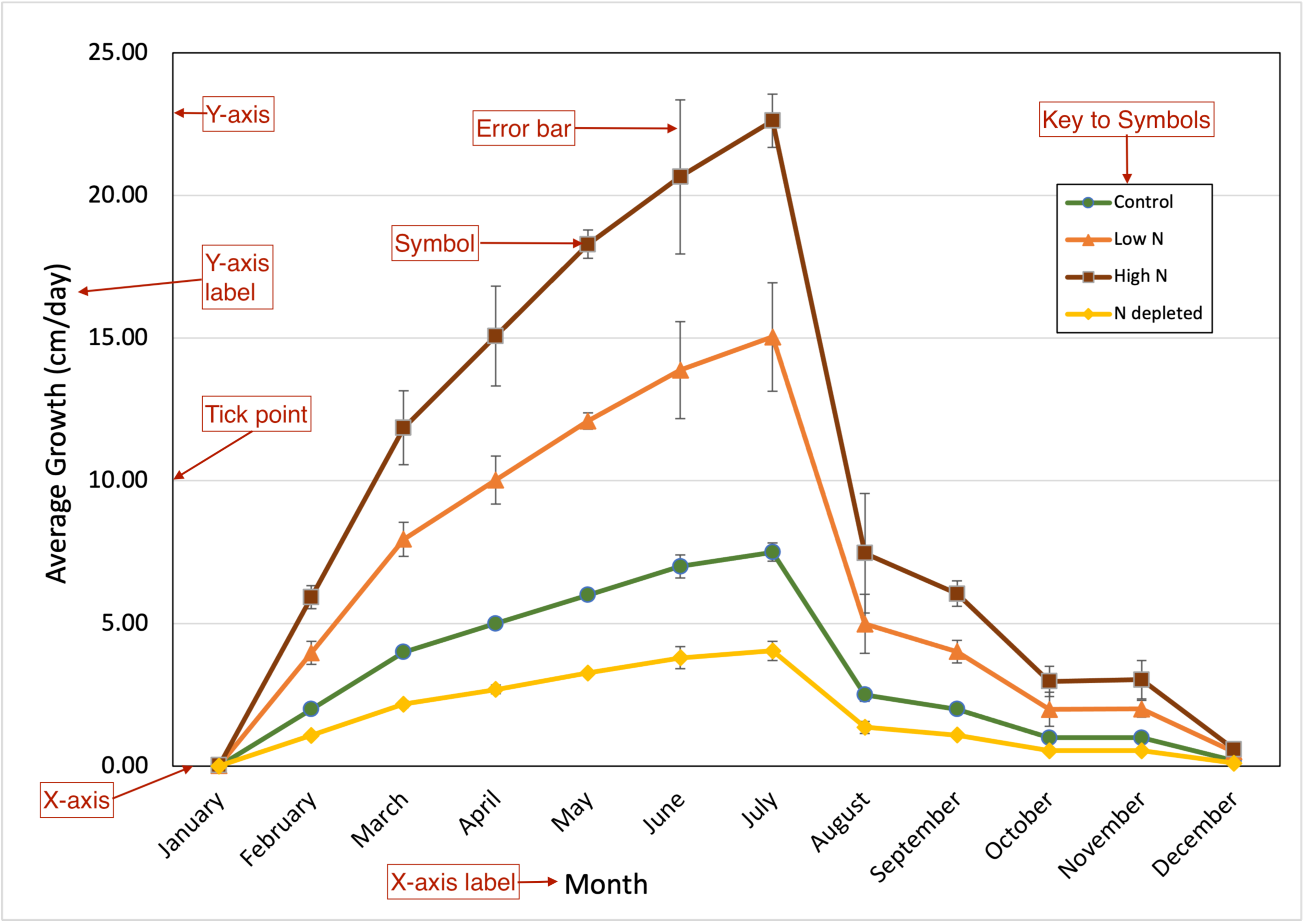
Figure 4. Effect of soil nitrogen levels on perennial vine growth over the year. Kudzu (Pueraria montana) vines were planted in native soil left fallow for 3 years (green line), fallow soil amended with nitrogen-containing fertilizer (two orange lines), or soil depleted of nitrogen by a cabbage crop the previous season (yellow line). Vines were allowed to establish for one year. New growth was measured starting with the emerging green shoots in January. In subsequent months, new growth was measured from the terminal pair of leaves on the previous month’s growth to the terminal leaves of the vine currently. Values are the means from n=25 separate vines. First panel. Average growth graphed without standard errors. Second panel. Average growth graphed with standard errors (± 1 s.d.)
15.1.3 X-Y or Scatter Plot/Graph
At first a scatter or X-Y plot looks similar to a line graph, but they are very different. A scatter plot shows the relationship between many different pairs of numerical variables. Each pair of observations is plotted as one point on a grid. The pattern of plotted points tells us about the relationship between the two variables.
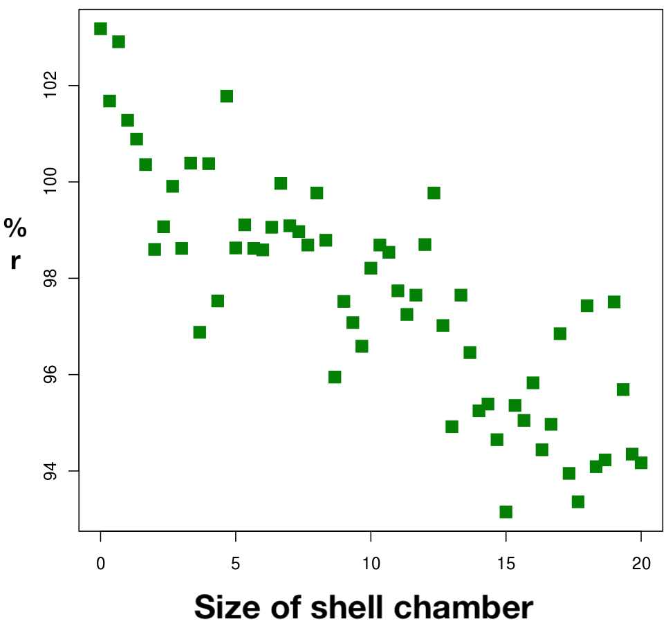
Scatter plots are a good choice for estimating the relationship or correlation between the variables. We also can add a regression line to a scatter plot and create a mathematical model of the relationship between the two variables.
A
B
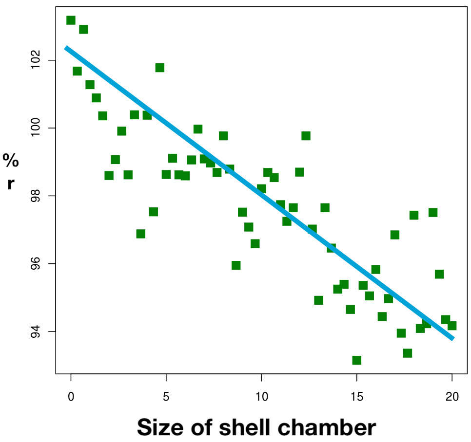
Figure 5. Inverse relationship between reproductive potential (% r) and size of shell chamber (in mm) of Gastropods. Values shown are for n=60 independently sampled animals. Panel A. Data distribution. Panel B. Distribution with linear regression prediction line.
15.1.4 Box-and-Whisker Plots
This is a very good way to summarize a lot of data points. These plots provide readers with more information about the underlying raw data, without actually showing the numbers. It also is a good choice if we want to combine numerical data with categories, and compare the distribution of data in each of the different categories.
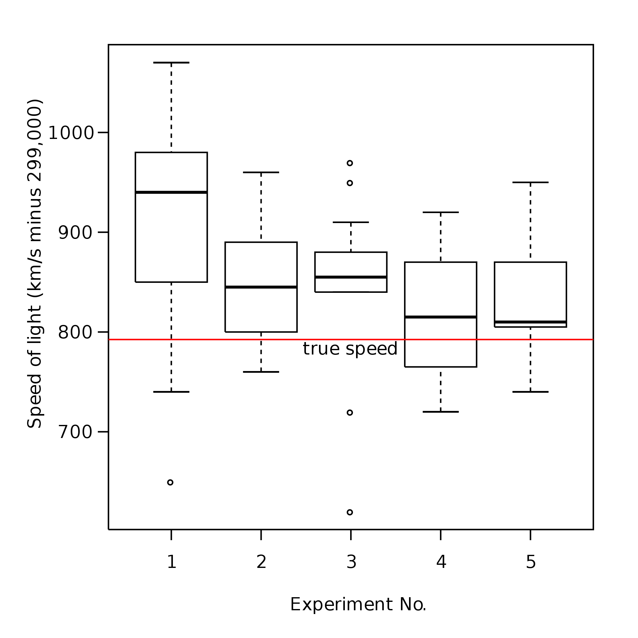
Figure 6. An example of a box-and-whisker plot.
To draw the plot, all of the data points collected for one treatment group are sorted from lowest to highest value. A box is drawn that contains the middle 50% of the data. Near the middle of the box is a line indicating the median value, and often a second symbol (a dot or star usually) to show the arithmetic mean of the data in the category. “Whiskers” around the box show the range of the remaining data points.
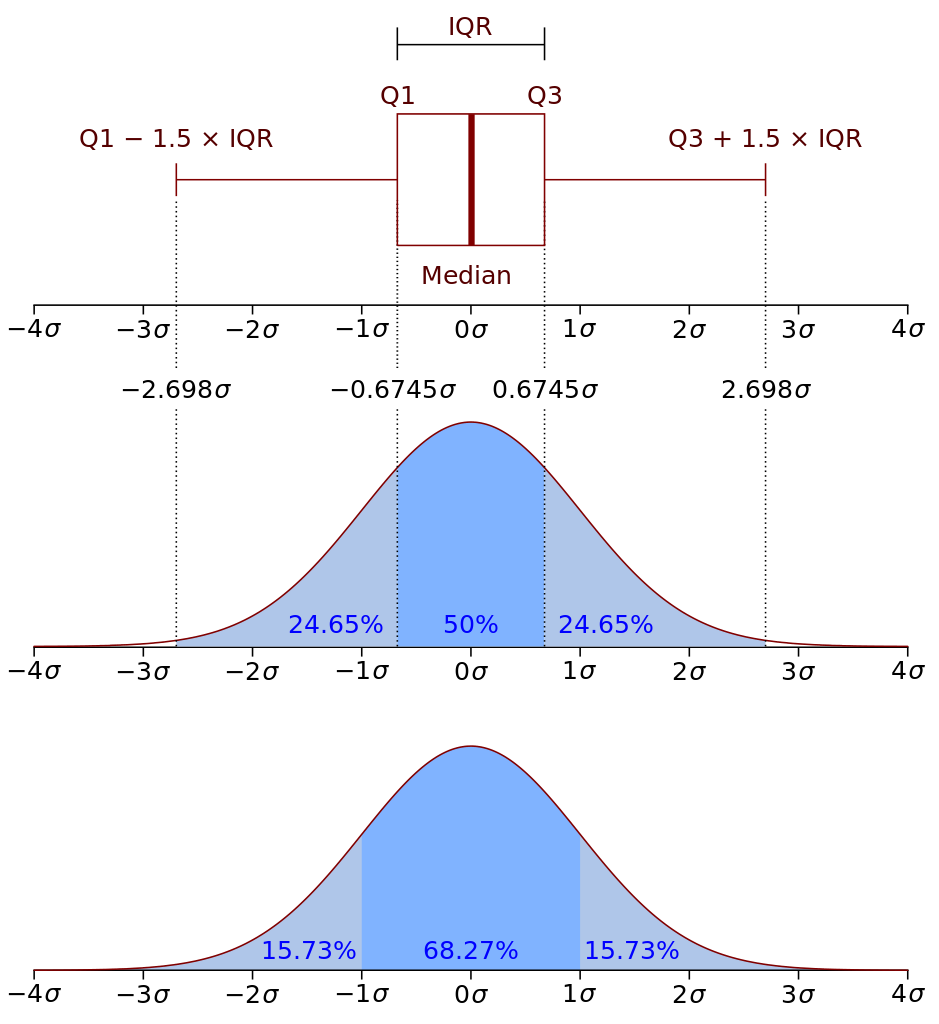
Figure 7. Map of the data distribution for an idealized box-and-whisker plot element. The top panel shows one box plot element turned on its side.
- The box shows the data range that contains 50% of all measurements. The difference between the top and bottom value in the box is the IQR (inter-quartile range).
- If we add whiskers to the box that are 1.5x the IQR, ~99% of all observed data points should be inside that range. Data points outside the whiskers are classified as outliers.
- Ideally the line representing the median value should be right in the middle of the boxed range. If it is not, then we know that the data are skewed (not smoothly distributed.)
- The data also may be skewed if the median line is not located close to the arithmetic mean for the category.
Despite their utility, MS Excel cannot creat box-and-whisker plots, so they are not as widely used as the other graph formats. To make box-and-whisker plots you will need more advanced (but still free) software like RStudio.